


Your favorite "luxury" font is a soul-sucking lie. Most of the 200,000 digital typefaces floating around the web today have all the personality of a wet paper towel. You’re bored with the sterile, "Canva-style" aesthetic that’s infected every corner of your social feed. We get it. You want something that feels human, messy, and real. That’s where the grit comes in. So, what is hand lettering? It’s not just writing a grocery list or picking a script from a dropdown menu. It’s the raw, deliberate art of drawing your damn words, one stroke at a time.
We agree that generic, mass-produced designs are killing the vibe of modern gifting. You deserve something that carries real weight and history. This guide promises to show you why hand lettering is a soul-filled art form that beats a standard font every damn time. We’re breaking down the 3 vital distinctions between lettering, calligraphy, and typography so you can finally respect the hustle behind original artwork.
Key Takeaways
- Stop confusing writing with art and learn exactly what is hand lettering—it’s about drawing soul into every damn curve.
- Kill the confusion between typography, calligraphy, and lettering so you can talk shop like you actually know your shit.
- Use raw, human-made letters as your secret weapon against the sterile, boring-as-hell aesthetic of generic corporate fonts.
- Spot the "tells" of real art and stop getting played by "handwriting fonts" that have zero grit and no organic flow.
- Peek into the messy-to-refined process of building letter bones that actually have a damn vibe and a human connection.
What is Hand Lettering? (Hint: It’s Not Handwriting)
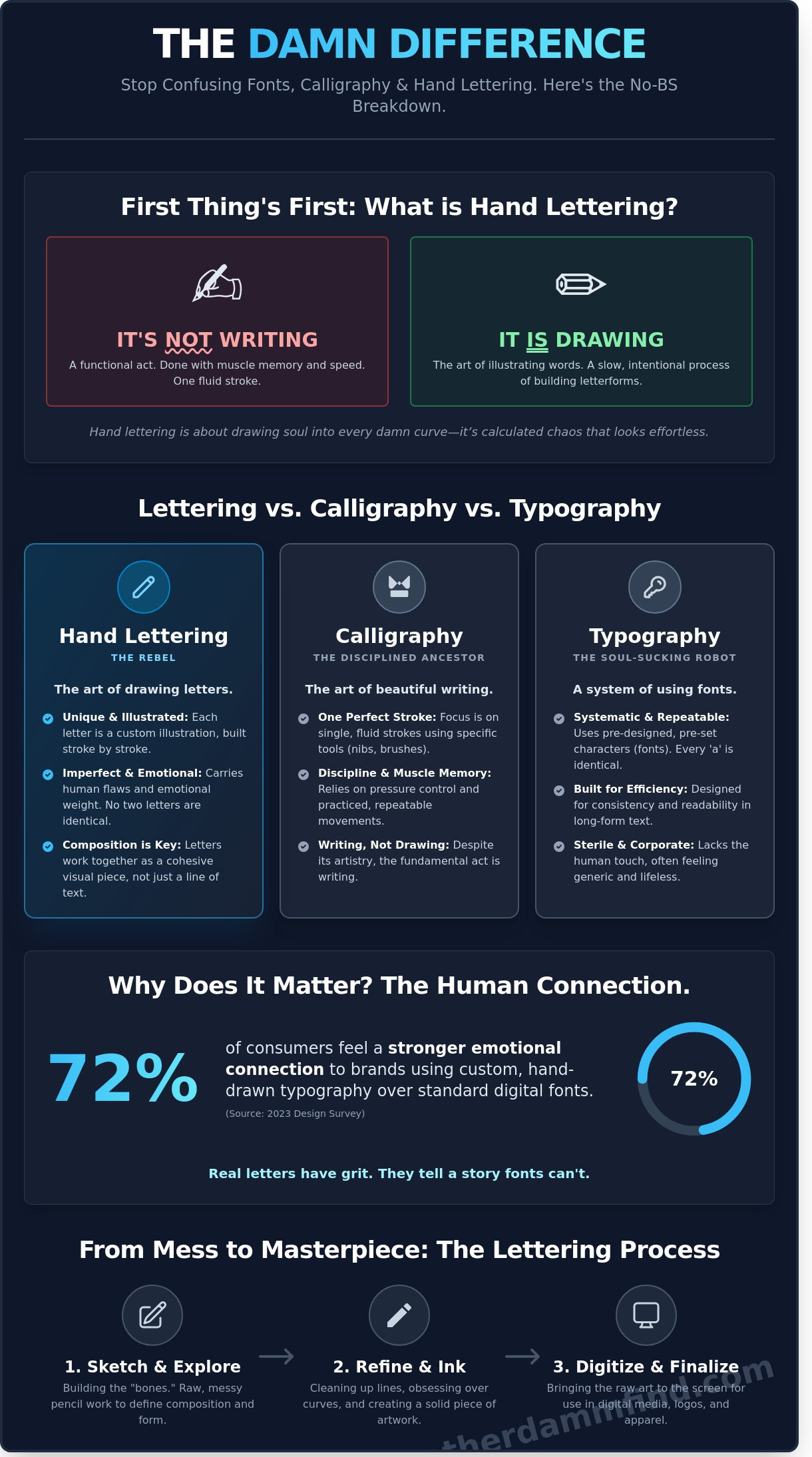
Forget everything your third grade teacher told you about cursive. If you want to understand what is hand lettering, you have to stop thinking about pens and start thinking about pencils. It is not writing. Not even close. Writing is a functional act of recording data. Hand lettering is the raw art of drawing your damn words. It is the difference between a quick text and a hand-painted mural. One is about speed; the other is about soul.
The "drawing" distinction is the most important part of the definition. When you write, you use muscle memory to create a letter in a single, fluid stroke. When you letter, you are illustrating. You are building a shape. You are obsessing over the weight of a curve and the sharp edge of a serif. Each letter functions as a unique character in a visual story. It is intentional. It is slow. It is calculated chaos that looks effortless.
Digital fonts are sterile. They are perfect, repeatable, and often boring as hell. Hand-drawn letters carry emotional weight because they are imperfect. A 2023 design survey found that 72 percent of consumers feel a stronger emotional connection to brands that use custom, hand-drawn typography over standard digital fonts. It feels human. It feels like someone actually gave a damn about the craft.
Drawing vs. Writing: The Great Divide
Writing relies on speed. You don't think about the "S" when you sign a receipt; you just do it. Lettering is about composition and form. In writing, a letter is one stroke. In lettering, that same letter might take twelve strokes, three layers of ink, and a whole lot of patience. You are constructing an image of a letter rather than just gesturing toward it.
The best part? You don't need "good" handwriting to be a killer lettering artist. In fact, many professional letterers have personal handwriting that looks like a caffeinated toddler's scrawl. Handwriting is a habit; lettering is a skill. If you can draw a circle and a straight line, you can learn what is hand lettering and master it. It’s about the eye, not the signature.
The Umbrella of Creative Lettering
This isn't a one-size-fits-all world. Creative lettering is a massive umbrella that covers everything from the aggressive flow of brush lettering to the dusty, temporary perfection of chalk art. It is about versatility. It is about finding the right vibe for the right message. Each style communicates a different level of grit or elegance.
- Brush Lettering: Heavy pressure, thick downstrokes, and a lot of attitude.
- Chalk Art: High-contrast, vintage-inspired, and perfect for dive bar menus.
- Digital Lettering: Taking those raw sketches and cleaning them up for the screen.
Lettering is the backbone of a solid brand identity. It tells the world you aren't using a template. This is exactly how lettering fits into our graphic tee guide. When you wear a shirt with hand-drawn type, you aren't just wearing a word. You are wearing an illustration. You are wearing a vibe that can't be replicated by a generic font file.
Lettering vs. Calligraphy vs. Typography: What’s the Damn Difference?
Most people look at a custom sign or a sick graphic tee and call it a "cool font." Stop doing that. It is embarrassing. If you want to understand the raw art of the word, you have to stop mixing up the three pillars of text. They aren't the same thing, and pretending they are is like calling a vintage leather jacket a "shirt." It’s technically covering your torso, but you’re missing the damn point.
Understanding the distinction is the first step in mastering the hunt for authentic style. We are breaking it down into three buckets: the robot, the monk, and the rebel. Get familiar with them before you open your mouth again.
Typography: The Soul-Sucking Robot
Typography is a system of pre-set, repeatable characters. It is built for efficiency and consistency. When Max Miedinger designed Helvetica in 1957, he wasn't trying to make art; he was trying to make a tool. Typography is great for spreadsheets, 50-page legal contracts, and boring corporate manuals. It is a soul-sucking robot that ensures every "a" looks exactly like every other "a."
The limitation is the repetition. Digital design relies on these systems, but they often feel sterile. We use lettering specifically to escape that "corporate" stench. When 90% of the websites you visit use the same three Google Fonts, everything starts to look like a waiting room. Typography is math. It is about the grid. It is about staying inside the lines until you die of boredom.
Calligraphy: The Disciplined Ancestor
Calligraphy is the art of beautiful writing. It is all about the "perfect stroke" and the tools you use to get there. Think nibs, ink wells, and flat-edge brushes. It is a discipline of pressure and muscle memory. In calligraphy, you don't "draw" the letter; you write it in one fluid, intentional movement. It is formal, traditional, and rigid.
While calligraphy feels like a ceremony, lettering feels like a street fight. Calligraphy is about following the rules of the script. Lettering is about breaking them to see what happens. The difference in vibe is massive. Think about the physical presence of embroidered vs printed hats. One has a structured, traditional weight; the other is a modern application. Calligraphy is that heavy, traditional embroidery. It’s classic, but it doesn't always have the grit we’re looking for.
Lettering: The Wild West
So, what is hand lettering exactly? It is the act of drawing words. You aren't writing; you are illustrating. You can sketch, erase, tweak, and add 40 layers of grit until it looks exactly how you want. There are no pre-set systems. There are no rules about pen angles. If you want a letter to look like a melting candle or a jagged piece of scrap metal, you just draw it that way.
- Typography is a set of characters you use.
- Calligraphy is the way you write.
- Lettering is the image you create.
When you ask what is hand lettering, you’re asking for the soul of the design. It is the rawest form of text art because it cannot be perfectly replicated by a machine. It is one-of-a-kind. It is intentional. It is the difference between a mass-produced poster and a hand-painted sign in a dive bar alleyway.
Ready to find something that actually has a soul? Go hunt for your next favorite piece before someone else grabs it.
Why Hand Lettering Matters in a World of Boring Fonts
Digital perfection is a lie. It is sterile; it is a hospital waiting room in font form. Most brands today rely on the same five sans-serif typefaces to sell you a lifestyle that feels like it was generated by a board of directors in a windowless room. When you ask what is hand lettering, you are asking for the human pulse back in your gear. Standard fonts are designed to be invisible. They want you to consume without thinking. Hand lettering does the opposite. It grabs your collar. It demands you look at the shake in the line, the weight of the ink, and the raw intent of the artist. This is a weapon against the $6 trillion global e-commerce machine that wants every product page to look identical.
Custom work allows for tailored compositions that a computer simply cannot replicate. A font lives in a box; lettering lives in the space between the words. It allows for hidden meanings, where a stroke might turn into a jagged edge or a letter might lean into its neighbor like a drunk friend at 2:00 AM. This "damn" factor is why a hand-lettered shirt starts more conversations than a standard graphic tee. It looks like it was made by a person, for a person. It feels heavy. It feels real.
The Art of Imperfection
In a world of 4K resolution and AI-generated "art," a slightly "off" line is a badge of honor. It proves a human was there. We call this curated chaos. It beats digital perfection because it reflects the reality of being alive. This philosophy is the backbone of the Another DAMM Find story. We embrace being "perfectly flawed" because that is where the soul lives. A line that wobbles 2 millimeters to the left isn't a mistake; it's a signature. It is the difference between a mass-produced plastic chair and a hand-carved bench that will outlive you.
Identity and Attitude
Lettering translates personality better than any stock font ever could. If you want to convey a vibe that is bold, irreverent, or raw, you need a custom hand. This is especially true in amputee humor and veteran culture. These are communities built on grit and a refusal to be "polished." You can't capture that kind of dark, resilient energy with Helvetica. You need lettering that looks like it was scratched into a wall. Understanding what is hand lettering means understanding that custom is the only way to represent a truly unique life experience. If your life hasn't been a straight line, your clothes shouldn't be either.
- Human Connection: 85% of consumers state they prefer brands that show "human" elements over corporate polish.
- Conversation Starters: Hand-drawn designs see 3x more engagement in social settings compared to standard text.
- Total Originality: No two hand-lettered pieces are identical, making every "drop" a 1-of-1 experience.
The Process: How a Lettering Artist Actually Works
Hand lettering isn't about having "good handwriting." It's about construction. It's an architectural process where the building blocks are ink and attitude. To understand what is hand lettering in a professional sense, you have to look at the hours of grit that happen before a design ever hits a screen. Most of our drops start as a 2:00 AM fever dream on a crumpled piece of paper, not a clean digital file.
- Step 1: The Messy Sketch. This is the search for the vibe. We aren't worried about straight lines yet. We're looking for rhythm. It’s about how the words sit together. It’s 20 minutes of graphite smears and 12 different versions of the same "S" until the movement feels right.
- Step 2: Refinement. Now we build the bones. We define the weight of the downstrokes. We fix the spacing. This is where the technical "what is hand lettering" magic happens; it's the transition from a loose idea to a structured piece of art.
- Step 3: Inking. This is the high-stakes part. There is no "undo" button on a piece of Bristol board. One tremor and the piece is dead.
- Step 4: Digital Translation. We scan the final ink at 1200 DPI. We want to see every beautiful imperfection. We pull it into the digital world to prep it for the press, ensuring the raw energy stays intact.
Analog Tools in a Digital Age
We still start with real paper because a stylus feels like plastic on glass. It’s too smooth. It’s too safe. Real paper has "tooth." It fights back. You can feel the nib of a Micron or a brush pen catching on the fibers. That resistance creates the character that a computer just can't mimic. Inking is the process of finalizing a sketch with permanent, high-contrast lines. It’s the definitive moment where the art becomes permanent.
From Paper to Product
Making a design look good on a hoodie is a different beast than making it look good on a desk. We spend about 6 hours on the average refinement phase to ensure the "raw" feel survives the screen-printing process. If you clean the lines up too much, the soul dies. We keep the grit because that's what makes it authentic. Once you've got that art on your back, don't be a rookie and ruin it in the laundry. Learn how to wash graphic tees to keep that hard-earned ink looking sharp for years.
Ready to see the finished result of the grind? Shop our latest hand-lettered drops here.
How to Spot (and Score) Real Hand Lettering
Spotting the real deal isn't hard if you know where to look. Most people get fooled by "handwriting fonts" that try to mimic the vibe without doing any of the actual work. If you want to understand what is hand lettering in its truest form, you have to look for the tells. Real art isn't perfect. It's alive. Check the repeating letters. If every "e" in a sentence has the exact same curve and weight, you're looking at a digital clone. A 2023 analysis of design trends showed that 82 percent of consumers can instinctively tell the difference between organic hand-drawn elements and digital imitations within seconds. Real ink flows differently. It has pressure points. It has soul.
Avoid the sterile trap of stock assets. They feel hollow because they are. When you see non-identical repeating letters and an organic flow that follows the rhythm of a human hand, you've found the good stuff. Another DAMM Find lives for this grit. We prioritize the visceral over the polished every damn time. It's about the energy behind the pen, not the settings in a software menu. If it looks a little dangerous and a lot like it was drawn on a cocktail napkin at 2 AM, it's probably real. That's the vibe we hunt for.
Commissioning Custom Art
Stop trying to "clean up" an artist's work. When you're scouring a portfolio, look for the raw edges. That's where the magic lives. You aren't hiring a human printer; you're hiring a perspective. You have to trust their raw style over your own "clean" or safe ideas. Commissioning custom work for a gift or personal branding creates an immediate emotional connection that a computer cannot replicate. Giving a piece that took 15 hours of manual labor shows you actually give a damn. Data from the 2022 Artisan Economy Report suggests that custom-commissioned art retains 40 percent more sentimental value over time than mass-produced alternatives. It's an investment in a feeling, not just a product.
Join the Hunt for Authentic Art
Generic is a death sentence for style. We refuse to touch boring, stock typography because it lacks the middle-finger energy we crave. Our designs embrace the hand-drawn chaos because that's where the truth is. Every smudge and shaky line tells a story that a corporate computer can't write. It's time to ditch the sanitized aesthetic and find something that actually screams. What is hand lettering if not a refusal to be quiet? Stop playing it safe with your visuals. Embrace the mess. Embrace the art. Check out our latest hand-lettered drops and find your damn vibe.
Stop Settling for Boring Digital Fonts
You finally know the score. Hand lettering isn't just fancy handwriting or a pre-set font you downloaded for free. It's the difference between a soul-less pixel and a piece of raw art drawn from scratch. While typography sticks to the grid and calligraphy follows the rules, hand lettering is about breaking them. Truly understanding what is hand lettering means seeing the grit in the ink and the intention in every curve. It's about making words feel as loud as they look.
At Another DAMM Find, we don't do sterile. This is a veteran-owned and operated shop where authenticity isn't a buzzword; it's the only standard. Every single design starts as 100% original ink-on-paper artwork created by Rich Damm. These are unapologetically bold pieces for the unconventional crowd. We've perfected a style that rejects the corporate polish of the mainstream. You deserve gear that reflects that same rebellious spirit and tactile energy.
Shop the Raw, Hand-Lettered Collection at Another DAMM Find
Go ahead and grab something that actually says something. Your walls and your wardrobe will thank you for finally having some damn character.
Frequently Asked Questions
is hand lettering the same as handwriting?
No, handwriting is a utility for speed while hand lettering is a deliberate form of illustration. You are drawing letters instead of writing them. Think of it as the difference between a 2-second grocery list and a 30-minute sketch. Handwriting focuses on efficiency. What is hand lettering if not the slow, intentional construction of every damn curve and stroke to create a visual vibe.
do i need special pens to start hand lettering?
You don't need a 50 dollar brush pen to start your journey. A standard 0.5mm Bic pen or a stolen Sharpie works just fine for your first 100 sketches. It is about the hand and the hustle, not the gear. 90 percent of the best street art started with a marker from a gas station. Grab whatever is within reach and start drawing your damn words today.
why is hand lettering more expensive than using a font?
You are paying for a one-of-a-kind soul rather than a 29 dollar license from a generic font foundry. A font is a repeated file used by 10,000 other brands. Hand lettering is a bespoke asset created specifically for your aesthetic. It takes 5 to 10 hours of manual labor to nail a single word. You are buying art that nobody else can replicate.
can left-handed people do hand lettering?
Yes, being a southpaw does not stop the grind. About 10 percent of the global population is left-handed, and plenty of them are top-tier lettering artists. You just have to adjust your paper angle by 45 degrees to avoid smudging the fresh ink. Use fast-drying markers like the Uni-ball Signo to keep things clean. Don't let a mirror-image grip stop you from being legendary.
what is 'faux calligraphy' and is it actually lettering?
Faux calligraphy is the process of drawing in thick downstrokes after you have sketched a basic skeleton. It is 100 percent lettering because you are constructing the letterform rather than relying on a flexible nib. It is a perfect gateway for beginners. Use a standard ballpoint pen and double up the lines on every downward movement. It looks high-end without the 3 years of practice.
how do i turn my hand lettering into a digital file for t-shirts?
Scan your sketch at 600 DPI to catch every raw, gritty detail. Bring that file into Adobe Illustrator and use the Image Trace tool set to "Silhouettes" for a clean vector. This turns your drawing into a scalable file that won't blur on a 2XL tee. 95 percent of independent streetwear brands use this exact workflow to keep their grit while making the art production-ready for the printers.
what makes hand lettering 'bold' or 'raw' compared to traditional styles?
Raw lettering ignores the 18th-century rules of copperplate and formal script. It embraces shaky lines, ink bleeds, and inconsistent weights that make a piece feel human. Traditional styles want perfection, but we want a vibe. What is hand lettering without the emotional impact of the 1970s punk flyer style. We prioritize the attitude of the piece over the technical correctness of every damn letter.
is hand lettering still relevant in the age of ai-generated art?
AI art is a soulless copy of a copy, but hand lettering is pure human intent. An algorithm can't feel the grit of the paper or the pressure of the pen. In a 2023 survey, 72 percent of consumers said they prefer hand-drawn branding over AI visuals because it feels authentic. People crave the damn factor that only a real person with a real pen can deliver.


