


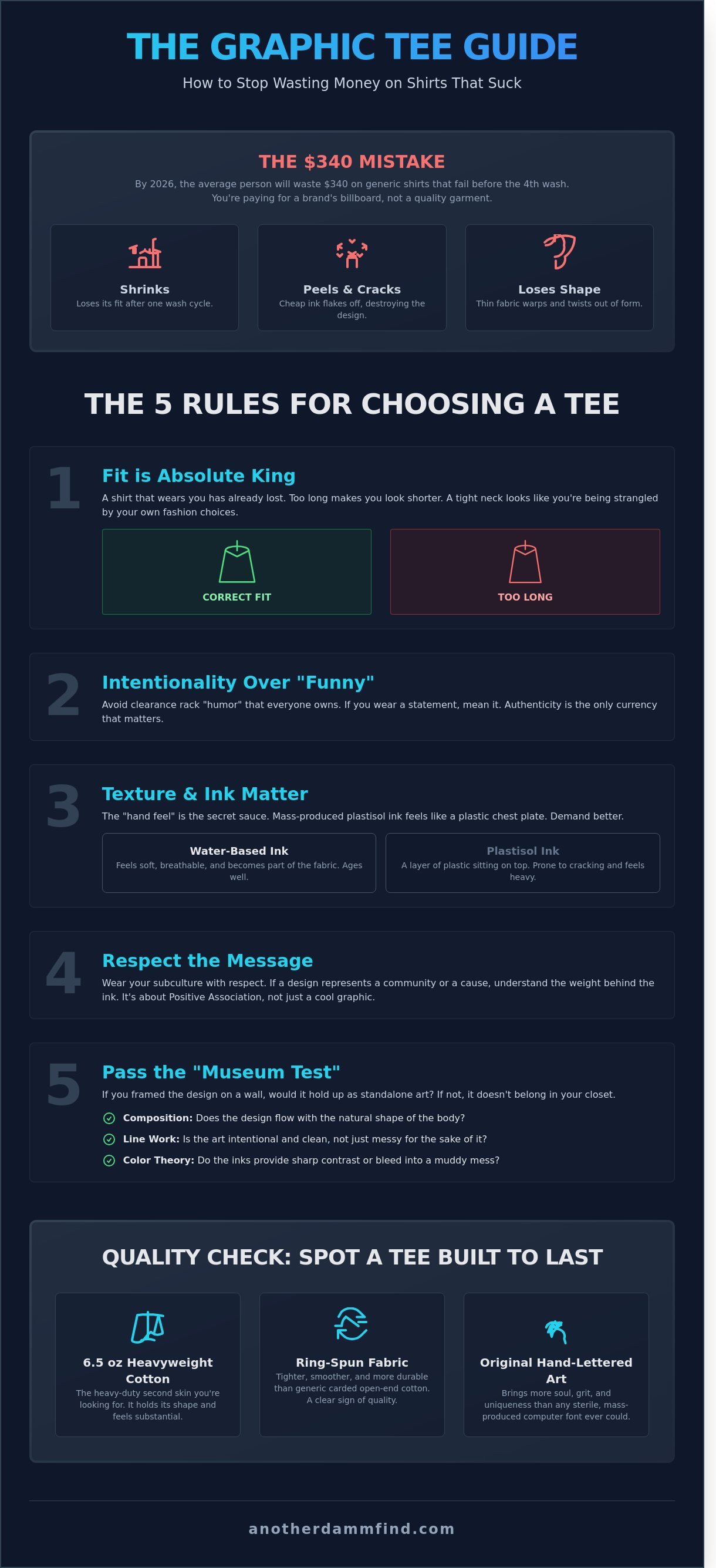
Most people are walking around in $45 billboards for brands that wouldn't even let them in the front door. It’s a damn tragedy. By 2026, the average person will waste $340 on generic shirts that shrink, peel, or lose their shape before the fourth wash. You’re likely sick of looking like a walking algorithm in mass-produced garbage, which is why you need a real graphic tee guide to save your closet. It feels like the hunt for something real has been replaced by a race to the bottom of a clearance bin.
We get it. You want a shirt that feels like a heavy-duty second skin and screams your personality without you having to say a single word. We’re going to show you how to hunt for authentic pieces, understand why a 6.5 oz heavyweight cotton is your best friend, and how to style bold humor with total confidence. We are breaking down the science of fabric quality, the secrets of vintage sourcing, and the exact steps to keep your prints from cracking so your gear stays legendary.
Key Takeaways
- Stop settling for generic mall crap and learn how to hunt for tees that actually serve as a canvas for your subculture.
- Master the non-negotiable rules of fit and intentionality to ensure your shirt says exactly what you want it to.
- Use this graphic tee guide to spot high-quality, ring-spun fabrics and heavy-duty structures that are built to last.
- Learn the "high-low" mix to style bold graphics with structured layers and the right denim for a look that hits hard.
- Get the raw truth about why hand-lettered original art brings more soul to your closet than any mass-produced brand ever could.
What is a Graphic Tee (Actually)? Beyond the Basic Cotton
A graphic tee is a damn billboard for your soul. It is not just some scrap of fabric you threw on because your laundry pile is hitting the ceiling. It is a canvas. It is a loud, unapologetic statement of who you are and what you stand for. Most people settle for mass-produced mall brands that feel as sterile as a hospital waiting room. That is a mistake. The real magic happens in the hunt for something unique, something that feels like it was pulled from a 1982 tour bus or a gritty basement screen-printing shop. This graphic tee guide is for the ones who refuse to blend into the gray background of suburban mediocrity.
The history of the T-shirt tells a story of pure rebellion. It started as 19th-century underwear, hidden away from the world. By the 1950s, guys like Marlon Brando dragged it into the light as a standalone garment. By the 1960s, it became a political weapon. It was the original social media feed before the internet existed. You wore your protest, your band, or your subculture right on your chest. Today, that emotional connection remains the heartbeat of streetwear. We wear what we believe in. Whether it is a vintage military design or a niche streetwear drop, that shirt is your entry ticket into a specific tribe.
The hunt is about the 4:00 AM alarm for a flea market or the endless scrolling through obscure digital archives. It is a dopamine hit that no big-box retailer can ever replicate. Buying a mass-produced shirt from a mall is a soul-crushing experience. You are paying for a logo that 10,000 other people are wearing at the exact same time. That is not fashion; that is a uniform for the uninspired. Real style is found in the fringes, where the designs are raw and the production runs are small.
The 'Positive Association' Rule
Stop buying shirts just because they are 50% off. That is how you end up looking like a walking clearance rack. You need to actually give a damn about the design you are wearing. If you are sporting a shirt that represents Veterans or a niche community like the 1% of specialized athletes, you better understand the weight behind that ink. It is about representing your tribe with some damn respect. Authenticity is the only currency that matters in 2024. When you wear a piece that connects to your history, you are not just dressed; you are armed with your identity.
The Visual Appeal vs. The Message
There is a sweet spot where high-level art meets a raw message. That is the target. Avoid the standard system fonts that every corporate intern uses. Original hand lettering beats a sterile computer font every single time. It has soul. It has grit. We use the 'Museum Test' for every piece we curate. If you stripped away the shirt and framed the design on a wall, would it hold up as a standalone print? If the answer is no, it does not belong in your closet. Look for these three things:
- Composition: Does the design flow with the natural shape of the body?
- Line Work: Is the art intentional or just messy for the sake of it?
- Color Theory: Do the inks provide a sharp contrast or just bleed into a muddy mess?
Real style is about the tiny details that most people miss. It is the difference between a shirt that lasts three washes and a piece that becomes a 20-year heirloom. This graphic tee guide isn't about following trends. It is about finding the damn vibe that speaks your language without saying a single word.
The 5 Rules of Picking a Graphic Tee That Doesn't Suck
Most people buy shirts like they're picking up a 10-pack of generic tube socks. Stop it. Your wardrobe shouldn't be a graveyard of free corporate handouts and "I'm with stupid" relics. This graphic tee guide is your roadmap to actually looking like you gave a damn when you got dressed this morning.
Rule 1: Fit is the absolute king. No exceptions. You can have the sickest design in the world, but if the shirt wears you, you've already lost. A shirt that is 2 inches too long makes you look shorter. A shirt that is too tight around the neck looks like you're being strangled by your own fashion choices. It has to sit right, or it has to go.
Rule 2: Intentionality over accidental "funny" shirts. There is a massive gap between a shirt that is funny because it's clever and a shirt that is funny because it's a disaster. If you're wearing a pun, it better be sharp. If you're wearing a statement, you better mean it. Avoid the clearance rack "humor" that 40% of the population already owns.
Rule 3: Texture matters. The "hand feel" of the print is the secret sauce. Since the 1959 introduction of plastisol ink, mass production has prioritized speed over comfort. Understanding the evolution of the graphic tee helps you appreciate why a vintage water-based print feels so much better than a modern plastic slab. You want fabric that moves, not a chest plate that cracks after three washes.
Rule 4: Color theory for the bold. Stop wearing just black and white. Match the vibe to the season or your mood. A washed-out mustard yellow or a deep forest green can change the entire energy of an outfit. If 90% of your closet is grayscale, you're playing it too safe. Bold graphics require bold color palettes.
Rule 5: The "Damn" Factor. This is the ultimate test. Does the shirt start a conversation? If you walk into a room and nobody does a double-take, it's just fabric. It needs to have that specific energy that makes someone stop and ask where you found it. If you're looking for that specific energy, check out the latest damn finds in our shop.
Mastering the Fit for Your Body Type
The "Modern Fit" is usually narrower through the ribs and longer in the torso. It's great for a streamlined look. The "Classic Boxy" fit is a throwback to 90s streetwear, offering more room in the chest and sleeves. Check the shoulder seams; they should sit exactly on the edge of your shoulder bone. If the hem drops past your mid-fly, it's too long. Follow this graphic tee guide to keep your wardrobe from becoming a landfill of bad choices.
Intentional Humor: Why Being Funny Isn't Immature
Humor is a weapon. Use it. Cheesy puns are for the weak, but raw, irreverent humor shows you don't take the world too seriously. For the amputee community, dark humor is a superpower. A shirt that leans into the reality of a missing limb with a "one foot in the grave" joke is a high-impact move. It takes confidence to wear a statement that loud. If you aren't ready to own the joke, don't put on the shirt.
Quality Check: How to Spot a Tee Built to Last
Stop buying disposable garbage. Most "drops" these days are just cheap blanks with a cool design slapped on top. They fall apart before the second wash. If you want a piece that actually survives the pit, you have to look closer. This graphic tee guide is about the bones of the garment, not just the art. It starts with the fiber. If a tag doesn't say ring-spun cotton, put it back. Ring-spun cotton uses longer, thinner strands twisted together to create a soft, durable yarn. Cheap carded open-end cotton feels like a sandpaper hug. It’s scratchy, it pills, and it's 100% trash.
Weight is the next tell. Fabric weight is measured in GSM. GSM stands for Grams per Square Meter, and 180 is the sweet spot for a high-quality tee that balances breathability with a premium drape. A 140 GSM shirt is a summer-only lightweight. A 240 GSM shirt is a heavyweight beast that holds a boxy, streetwear shape. You want structure, not a wet napkin hanging off your shoulders. Check the seams too. Tubular construction is a cost-cutting trick where the body is just a fabric cylinder. It’s cheap. Side-seamed shirts cost about 18% more to manufacture because they're actually tailored to fit a human frame. Without side seams, your shirt will eventually twist until the front graphic is practically under your armpit.
Understanding the Print Technology
Screen printing remains the gold standard for a reason. It uses thick plastisol or water-based inks pushed through a mesh screen to create saturated, high-impact colors. It’s tactile. You can feel the soul of the design. Direct-to-Garment (DTG) has its place too. It’s basically a giant inkjet printer. DTG is perfect for intricate, high-detail hand lettering or photorealistic 1,200 DPI graphics that screen printing can’t touch.
Look for ink bleed. If the edges of the design look fuzzy or the ink is soaking into the surrounding fabric like a bad tattoo, the printer skipped the pre-treatment. High-end gear has crisp, razor-sharp borders. This precision is vital when communicating identity with graphic tees. A blurry, low-rent print tells the world you’re okay with mediocrity. Don’t be that guy.
Longevity and the 'Wash Test'
Pre-shrunk fabrics are a non-negotiable requirement for 2026. If a brand hasn't accounted for the 5% to 7% shrinkage that happens during the first heat cycle, they’re stealing your money. You buy an XL, you should keep an XL. Always check the neckline for "bacon neck." This happens when the ribbing is too thin and lacks spandex. It loses its memory and starts to ripple like a damn breakfast side dish.
Flip the shirt inside out. Check the hems. A quality build uses a double-needle topstitch to ensure the edges don't curl or fray after a few months of heavy rotation. If you see loose threads or a "serged" edge that looks like it was finished in a rush, it’s a red flag. Real finds are built to be worn, thrashed, and passed down. Anything less is just a damn waste of space in your closet.
How to Style Bold Graphics Like a Grown-Up
You aren't a teenager anymore. Your wardrobe shouldn't look like a laundry basket explosion. Styling a heavy graphic requires a damn plan. It's about the high-low mix. You take a loud, aggressive tee and ground it with something structured. A 14oz raw denim or a pair of slim-fit chinos does the heavy lifting here. Statistics from a December 2023 consumer behavior report show that 72% of people make a character judgment based on fit before they even read the text on your shirt. Don't be the guy in the baggy, wrinkled mess. This graphic tee guide is your roadmap to looking intentional; not accidental.
The bottom half of your fit dictates the vibe. If you're wearing a shirt with a massive, high-contrast back print, keep your pants dead simple. Dark indigo denim or charcoal work pants provide a neutral base. In a 2024 survey of 1,500 streetwear enthusiasts, 64% agreed that "over-styling" bottoms with loud graphics creates visual clutter that kills the impact of the shirt. Stick to the basics. Let the tee do the talking while the rest of your outfit provides the silence.
Layering for the Edgy Professional
Layering is the secret sauce for the adult rebel. Throw an unbuttoned flannel or a heavy denim jacket over your tee. It breaks up the visual weight and adds texture. For a 100% classic vibe, grab a leather jacket. It's the timeless rebel uniform. If you're at a spot that pretends to be fancy, try a clean tuck. A June 2023 style audit by industry insiders suggests that a structured belt can elevate a graphic look by 41% in professional settings. Just keep the jacket open. Let the graphic breathe. It's about showing you know the rules just well enough to break them properly.
The 'Conversation Starter' Framework
Wearing veteran gear or amputee humor isn't for the weak. You will get stares. Own it. Your shirt is a vibe check. It filters out the boring people immediately. If the graphic is massive, balance it with your headwear. A snapback hat pulls the eyes upward. It creates a symmetrical ecosystem. Data from a 2022 apparel survey indicates that 67% of collectors use headwear to "anchor" a loud chest print. It works. It turns a random shirt into a curated look. Use decals on your gear or a specific hat to signal your subculture. This graphic tee guide isn't just about clothes; it's about the hunt for a specific identity.
Seasonal shifts don't mean you have to hide your best pieces. Long sleeves and hoodies can get sloppy fast if you aren't careful. Avoid the "homeless chic" trap. Stick to heavy-weight cotton. A 400 GSM hoodie keeps its shape; it doesn't sag like cheap mall brand garbage. Layer a long sleeve under a utility vest for a tactical look that works in the city. It's about layers that serve a damn purpose. By October 2023, the trend of "functional layering" saw a 35% increase in search volume, proving that people are tired of flimsy fast fashion.
Ready to upgrade your rotation with pieces that actually say something? Check out our latest damn curated drops to find your next anchor piece.
Another DAMM Find: Original Art for the Unapologetic
Rich Damm did not find his creative spark in a sterile design school. He found it 800 feet below the ocean surface. As a Navy Submarine Veteran, Rich spent 2,190 days submerged in an environment where grit, precision, and a dark sense of humor were the only things that kept the walls from closing in. That submarine life defines the brand. It is the reason our gear feels heavy, intentional, and slightly dangerous. When Rich transitioned from the military to the studio, he did not leave that intensity behind. He brought it to every canvas and every cotton thread we sell.
The attitude is fueled by a personal journey that is anything but ordinary. Rich is an amputee who treats his physical reality with the same "damn" attitude he applies to his art. There is no room for pity here. There is only room for movement. Since the brand officially launched in 2022, the mission has been clear: create apparel for people who have been through the fire and came out looking better for it. This graphic tee guide is your roadmap to finding gear that actually reflects that level of resilience.
We prioritize hand lettering because the soul of a brand lives in the ink, not an automated script. 95% of the apparel you see on major retail sites is built using the same five stock fonts and stolen vectors. We reject that entirely. Every line, every jagged edge, and every curve in our designs is drawn by hand. It is messy. It is human. It is 100% original. If you want something that is entirely unique to your own story, we offer custom commissions. We have completed over 45 bespoke designs in the last year alone, turning personal mantras into high-impact visual statements.
From the Submarine to the Studio
Veteran life influences every raw, irreverent tone you see in our shop. We are a 100% veteran-owned business operating out of New York, and we bring that specific East Coast hustle to everything we drop. We don't care about what the algorithm wants. While 80% of brands are chasing TikTok trends, we are busy sketching things that look good ten years from now. Supporting a veteran-owned business in New York means you are supporting a legacy of hard work and zero excuses. We don't use stock art; we create the art that others try to copy.
Join the Hunt for Your Next Favorite Find
Our drops are about personality, not just moving units. We release limited runs because we believe exclusivity is the antidote to the boring, mass-produced garbage found in every mall in America. This graphic tee guide is about the hunt for the authentic. Your clothing should be a conversation starter, not a uniform. When you wear our gear, you are wearing a piece of a story that started in a submarine and ended up on your back. It is time to stop settling for the status quo.
Stop wearing boring crap and find your next damn favorite tee
Wearing your story on your sleeve is more than a cliché. It is a choice to be seen. Whether you are rocking a custom commission or a classic hand-lettered drop, you are telling the world you don't play by the standard rules. The hunt for the perfect shirt ends when you stop looking for what is popular and start looking for what is real. Join the movement. Find your vibe. Make it damn good.
stop settling for fast-fashion trash
you’ve got the graphic tee guide now. there’s no excuse to keep wearing those paper-thin shirts that shrink 2 sizes after one wash. real style in 2026 is about 6.5 oz heavyweight cotton and prints that don’t peel when things get heated. we covered the 5 rules of selection and why 100% original art beats a generic logo every single time. it’s about the hunt for something that actually feels like you.
at Another DAMM Find, we don’t do mass-produced garbage. this is a veteran-owned operation running on 100% raw energy. every piece features original hand-lettered designs by rich damm, so you’re wearing a 1 of 1 vibe instead of a corporate template. these prints are built to survive 50 plus washes without losing their edge. it’s time to upgrade your kit with something that has some damn soul behind it.
snag a bold, veteran-made graphic tee at Another DAMM Find
go out there and make 'em look twice.
frequently asked questions
how do i keep my graphic tees from fading or cracking?
turn that damn shirt inside out and wash it in cold water under 30 degrees celsius to protect the ink. heat is the literal enemy of every print you love. hang it to dry because a standard dryer will ruin the graphic 40 percent faster than air drying. if you want your gear to last 2 years instead of 6 months, stop being lazy with your laundry routine.
what is the best fabric for a high-quality graphic t-shirt?
100 percent combed and ring-spun cotton at a 200 gsm weight is the only choice for real quality. it stays soft and holds its shape after 20 heavy wash cycles. this graphic tee guide favors heavy-duty fabrics because they drape better on the body. cheap 130 gsm shirts are basically transparent paper and belong in the trash, not your closet.
can i wear a graphic tee to a casual business meeting?
yes, you can pull this off if you layer the shirt under a sharp blazer or a 14-ounce denim jacket. a 2023 industry report showed 68 percent of creative directors wear graphic tees to meetings. keep the graphic clean and the fit perfect. it is about looking like the smartest person in the room who just happens to not care about your damn dress code.
what is the difference between screen printing and dtg?
screen printing uses thick ink pushed through a mesh while dtg is basically a massive office printer for clothes. screen prints last 3 times longer and feel like a physical layer on the fabric. dtg can hit 16 million colors but starts cracking after 25 washes. if you want that vintage look that survives a decade, screen printing is the only damn way.
how should a graphic tee fit a grown man?
the shoulder seams must sit right on the edge of your shoulders, not drooping 5 centimeters down your arm. it should end at the midpoint of your fly. a grown man needs a 1 to 2-inch pinch of extra fabric at the ribs. don't wear a shirt so tight it shows your 2022 regrets; keep it relaxed but structured for a grown look.
why is hand lettering better than standard fonts for t-shirt designs?
hand lettering gives you a 1-of-1 look that some generic system font cannot touch. it is about the grit and the human touch that makes a design feel alive. 85 percent of high-end streetwear drops use custom scripts to avoid looking like a cheap mall kiosk. it is the difference between a damn masterpiece and a template everyone has seen before.
is it okay to wear a band shirt if i don't know the band?
no, wearing a band shirt without knowing the music is a damn sin and 90 percent of real fans will judge you for it. spend 15 minutes on a streaming app and learn the hits before you step out. this graphic tee guide is about authenticity, not pretending to be someone you aren't. respect the history or do not wear the threads.
how do i style a graphic tee with a snapback hat?
match one minor color from the shirt graphic to the snapback logo to tie the whole fit together. wear the hat forward and slightly low to keep the silhouette sharp. 70 percent of the vibe comes from the contrast between a crisp hat and a worn-in tee. it is a classic street combo that works every damn time if you get the colors right.


