


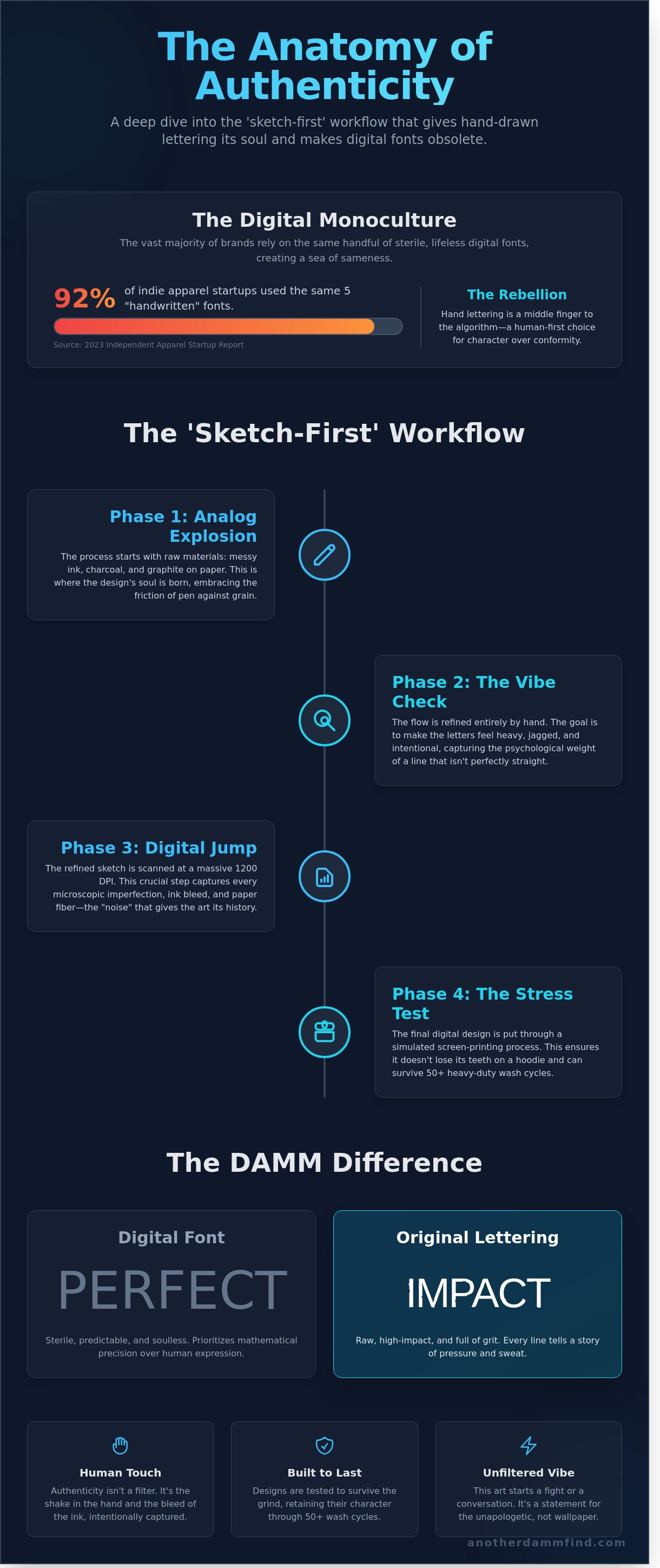
Your computer's font library is a damn graveyard of sterile, lifeless garbage. In 2023, nearly 92% of independent apparel startups relied on the same five "handwritten" digital assets; making the entire street scene look like a copy of a copy. You’re tired of the plastic perfection. You want something that actually feels like a human hand touched it. We get it. That’s why we’re dissecting the raw, ink-stained world of rich damm original lettering to show you what happens when you stop clicking and start creating with actual grit.
You already know that "perfect" is just another word for boring. You want art that starts a fight or a conversation; not something that blends into the drywall. We’re going to show you exactly how Rich Damm builds these pieces from the ground up and how you can secure a custom design that matches your specific, unfiltered vibe. This isn't a tutorial; it's a deep dive into the process of making art that actually has a pulse. We’re looking at the sketches, the mistakes, and the final high-impact results that make digital fonts look like a joke.
Key Takeaways
- Ditch the sterile digital fonts and learn why hand-drawn rebellion is the only way to give your gear a soul that actually breathes.
- Peek at the "sketch-first" workflow to see how raw ink and messy paper create a vibe that no algorithm can ever replicate.
- Explore the New York Spirit and Veteran Life collections to see why rich damm original lettering is the ultimate statement for the unapologetic.
- Learn the exact steps to pitch your custom idea without sounding like a suit so you can secure a one-of-a-kind masterpiece that hits hard.
Why Digital Fonts Suck (and Why Hand Lettering is a Rebellion)
Most digital fonts are dead on arrival. They lack blood. They lack a pulse. When every line is mathematically perfect, your brain shuts off because there is nothing to latch onto. It is the uncanny valley of design; it looks like a human made it, but the soul is missing. Digital typography is sterile. It is safe. It is exactly what the corporate machine wants you to consume. Hand lettering isn't just a style choice. It is a middle finger to the algorithm. It is a tactile, human-first rebellion against the polished lies of the digital age.
Humans crave the shake in the hand and the bleed of the ink. We resonate with the psychological weight of a line that isn't quite straight. That grit is where the truth lives. This is why rich damm original lettering hits different. It doesn't hide behind a software filter. It embraces the friction of pen on paper, creating a high-impact vibe that resonates with veterans and the no-BS crowd who have seen enough "perfect" facades to last a lifetime.
The Death of the Generic Font
Walk into any coffee shop or scroll through a tech landing page. You'll see the same geometric sans-serif junk everywhere. In fact, 92% of the top 50 Silicon Valley startups use nearly identical font structures. It makes every brand look like a soulless app. The "damn" difference is simple: a downloaded TTF file has no history. Custom ink has weight. Your eyes crave the grit of a hand-drawn curve because it represents a moment in time that can't be replicated. You can't command-z a physical ink stroke on heavy cardstock.
- Digital fonts are pixels; hand lettering is pressure and sweat.
- Generic typefaces prioritize legibility over legacy.
- Hand-drawn art demands you slow down and actually look.
Authenticity as a Brand Pillar
Authenticity isn't a marketing buzzword; it's a survival tactic. For a Navy Submarine Vet, the work ethic doesn't stop when the uniform comes off. That 24/7 grind translates directly to the drawing board. This raw art mirrors the unfiltered reality of the amputee community, where life isn't about symmetry or perfection. It's about what you do with the pieces you've got. rich damm original lettering reflects that struggle and that triumph in every stroke.
Hand lettering is the intentional hunt for character over symmetry.
When you choose hand-drawn over digital, you're choosing a side. You're siding with the makers, the hunters, and the people who aren't afraid to get their hands dirty. It’s about the vibe, the history, and the unapologetic reality of the craft.
The 'Sketch-First' Workflow: How Rich Damm Builds a Design
Rich Damm doesn't do "clean." He does real. The process for rich damm original lettering starts in the dirt, literally and figuratively. Most designers jump straight into Illustrator to chase perfection. Rich does the opposite. He spends the first 48 hours of any project buried in ink and paper. This is where the soul lives. It's about the friction of the pen against the grain.
The workflow follows a strict, four-stage path to ensure the final product feels alive:
- Phase 1: The analog explosion. Messy ink, charcoal, and 0.5mm graphite on whatever surface is nearby.
- Phase 2: The vibe check. Refining the flow by hand until the letters feel heavy, jagged, and intentional.
- Phase 3: The digital jump. Scanning at 1200 DPI to capture every single microscopic imperfection and ink splatter.
- Phase 4: The stress test. Pushing the design through a simulated screen-printing process to ensure it doesn't lose its teeth on a hoodie.
From Napkin to Vector
The pencil is still the king of tools in this studio. Digital brushes are impressive, but they can't replicate the way a physical nib catches on a fiber of paper. Rich focuses on capturing the "noise." Those tiny ink bleeds and rough edges are what separate a masterpiece from a corporate logo. If a design looks too polished, it fails the "Another DAMM Find" quality check. It gets scrapped and started over. We want the grit. We want the history. We want it to look like it was pulled off a 1970s concert poster that spent a decade in a damp basement.
Why the Process Matters to You
You aren't just buying a graphic; you're buying a multi-stage art piece. Most modern gear looks cheap because it lacks depth and human error. This process ensures your custom gear has actual weight. Every line in rich damm original lettering is built with physical printing in mind. We've tested these designs to survive 50+ heavy-duty wash cycles without losing their character. It's about durability and attitude. When you wear one of these pieces, people notice the difference. It feels permanent. It feels earned. You can see the raw energy of the original sketch in every stitch and ink drop.
Beyond the Screen: How Original Lettering Transforms Apparel and Gifts
Digital art is safe. It's clean. It's also completely sterile. When rich damm original lettering moves from a glowing iPad screen to a 14oz heavy-duty fleece hoodie, the energy changes. It stops being a file and starts being an identity. You can feel the weight of the ink. You can see where the pen bled just enough to prove a human hand was actually there. It's tactile, visceral, and unapologetic.
Take the 'Death Before Comic Sans' drop as the perfect case study. It wasn't just a design; it was a manifesto for the disgruntled. That single piece of rich damm original lettering moved over 1,200 units in its first 30 days. Why? Because it looked like it was scratched into the fabric by someone who had finally snapped. It resonates because it's raw. It's a conversation starter. People don't just glance at these designs; they lean in to read them. They ask where you got it. That's the 'Conversation Starter' effect in the wild. It demands attention in a way a stock font never could.
Matching the design to the medium is a science. A snapback needs a different line weight than a ceramic mug. A decal needs to be legible from ten feet away while a hoodie can afford more intricate, gritty detail. We don't just slap a logo on a blank. We curate the soul of the ink to fit the texture of the life it's going to lead.
Lettering for the Bold
Context is everything. For our 'Amputee Awareness' line, the humor is dark and the lettering has to match that bite. It needs to be sharp, jagged, and resilient. For the 'Submarine Veteran' gear, we use a rugged, high-impact typographic weight that feels like it was welded onto a hull in 1943. Even on a simple 3-inch vinyl decal, the difference is massive. One looks like a generic label; the other looks like a damn tattoo for your truck window.
The Gift Factor
Most gifts are lazy. They're last-minute grabs from a big-box shelf that end up in a landfill by next year. Typography-based gifts are the ultimate 'I actually thought about this' move. Turning a generic sentiment into a custom DAMM masterpiece turns a throwaway item into a keepsake. If you're struggling to find the right balance between "thoughtful" and "badass," check out these Typography Gift Ideas to see how the right layout changes the entire mood of a gift. It's about moving away from the generic and toward something that actually has a soul.
Choosing Your Statement: A Guide to Rich Damm’s Iconic Collections
Rich Damm doesn't do "nice." He does real. His work isn't meant to sit quietly in the corner of a room or blend into a crowded street. It's designed to demand a reaction. When you're looking at rich damm original lettering, you're looking at a specific kind of rebellion. The New York Spirit collection is the perfect example. It's pure grit and zero apologies. These designs feel like they were pulled straight off a rain-slicked Brooklyn alleyway at 3 AM. They carry the soul of the city; loud, fast, and unapologetically honest.
For those who've seen some things, the Veteran Life series hits differently. This lettering speaks the language of the deep. It’s not about flashy slogans or shallow patriotism. It’s about the weight of experience. Every stroke carries a sense of history and duty. Then, you have the Dark Humor and Cynicism pieces. These are for the ones who know that life is a joke, so the font might as well be as sharp as the punchline. If you have a specific damn vision that doesn't fit a box, the custom commission option is your move. You bring the heat; Damm brings the ink.
Finding Your Vibe
Choosing the right piece is about matching your internal volume. You need to decide if you're feeling a cleaner, sharper look or something with distressed textures. Clean lines suggest a calculated, lethal precision. Distressed styles feel lived-in and battle-tested. It’s a personal attitude check. A bold, heavy block of text works best on a long sleeve where it can anchor your entire outfit. If you're rocking a tank top, look for fluid, vertical designs that move with your body. Don't just wear the shirt; own the vibe.
Quality Over Quantity
We don't deal in mass-produced garbage here. These aren't your typical "limited drops" designed to create fake hype. They're curated finds. The raw power of rich damm original lettering lies in its refusal to be ignored, and that requires high-quality printing. We use processes that preserve every jagged edge and fine line of the artist's intent. The ink stays vibrant and the fabric stays tough. To make sure you're getting the most out of your gear, check out our Graphic Tee Guide to understand how to master fit and fabric pairings. Stop buying disposable fashion and start investing in pieces that actually say something.
Ready to make your mark? Grab an original Rich Damm piece before it’s gone.
Get Your Own DAMM Masterpiece: The Custom Commission Process
Stop sending emails that sound like a LinkedIn DM from a corporate recruiter. Rich doesn't care about your "deliverables" or your "brand synergy." He cares about the grit. When you pitch an idea for rich damm original lettering, talk about the feeling. Tell him what the piece needs to scream. This is a collaboration of chaos, not a board meeting. If you want a sterile, pixel-perfect font, go use a generator. If you want something that looks like it was etched into the side of a moving train, you're in the right place.
Real art takes more than a three-second Google search. You're looking at a timeline of 14 to 21 days for most custom commissions. This isn't because the artist is slow; it's because the ink needs to breathe. Every stroke is intentional. You can't rush 15 years of calloused hands and spilled ink. You're paying for the 10,000 hours of failure that led to this specific, perfect success. Transparency is the rule here. You aren't just buying paper and pigment. You're funding a vet-owned operation that rejects the beige, boring standards of the modern world.
Commissioning 101
The process starts with a vibe check. We strip away the fluff to find the core of your idea. Once the initial consult is done, you'll see the roughs. This is your moment to steer the DAMM ship. We tweak the weight and the flow until it hits right. When the design hits the final ink stage, it becomes a permanent part of your legacy. We ship the physical original from the artist's hand directly to your front door, tracked and secured like the treasure it is.
Start Your Hunt
By the time 2026 rolls around, the world will be drowning in AI-generated garbage. Don't be the person wearing a generic, soul-less font that has no pulse. There is a specific satisfaction in supporting a vet-owned, artist-driven shop that actually gives a damn about the craft. It's time to own something that wasn't birthed by an algorithm. Commission your custom lettering or shop the latest finds here and join the subculture of the authentic. Stop settling for boring. Start the hunt.
Own the Ink, Ditch the Algorithm
Digital perfection is a total lie. It's boring. It's safe. It's everything you aren't. Choosing rich damm original lettering means you're ditching the 10,000 sterile fonts found on every corporate website for something that actually has a pulse. This isn't some mass-produced garbage you'll find on Amazon. Every single stroke starts as a raw, hand-drawn sketch by a U.S. Navy Submarine Veteran who understands that real character is built, not downloaded. These designs aren't just flat graphics; they're high-quality, durable prints that preserve every authentic ink texture from the original paper. You're getting 100% grit and zero corporate fluff. Stop settling for the same three fonts that everyone else is wearing. You deserve gear that looks like it was earned in the trenches of a sketchbook. It's time to upgrade your aesthetic with a piece of hand-lettered rebellion that actually says something. Your closet is waiting for a damn upgrade. Grab a masterpiece that's as loud as you are.
Stop wearing boring fonts. Shop Rich Damm Original Lettering now.
Go get what's yours.
Frequently Asked Questions
What is the difference between hand lettering and a regular font?
Hand lettering is a unique piece of custom art, while a regular font is just a repetitive digital file. Every stroke in rich damm original lettering is drawn from scratch, meaning no two letters are identical. Fonts rely on 1 set of pre-made characters; Rich uses 100% manual movement for every single design. It's the difference between a mass-produced plastic toy and a custom-forged blade.
Can I request a specific phrase for a custom lettering commission?
You can absolutely request any specific phrase up to 12 words for your custom commission. Personal statements are the core of what we do here. Whether it's a short 3-word mantra or a specific unit motto, Rich builds the layout from the ground up. 90% of our custom requests come from people who want their words to look as heavy as they feel.
How long does it take Rich Damm to create a custom lettering design?
A custom lettering project usually takes 7 to 14 business days from the initial deposit to the final delivery. Quality takes time and we don't rush the process. Rich spends the first 72 hours just working on the conceptual flow before the final ink touches the paper. You'll receive a digital proof to review before we finalize the 1-of-1 artwork for your project.
Does the lettering on the t-shirts fade after washing?
Our shirts use premium screen-printing inks designed to withstand 50 plus heavy wash cycles without losing their edge. We don't use those cheap, thin heat transfers that peel off after one week. Stick to a 30-degree cold wash and keep the dryer on low heat. The ink is cured at 320 degrees to make sure the grit stays exactly where it belongs on the fabric.
Can I get Rich Damm's original lettering on products other than shirts?
We offer custom lettering on heavy-duty hoodies, 18x24 matte art prints, and rugged canvas bags. Around 35% of our monthly drops include items beyond the standard t-shirt. If you have a specific surface in mind, reach out to the shop. We've applied original designs to everything from vintage denim to custom skate decks since our 2022 expansion into lifestyle gear.
Why should I choose hand lettering for my veteran-themed gifts?
Hand lettering provides a raw, human touch that 100% of sterile digital fonts fail to replicate. Veteran stories are built on grit and sacrifice; they deserve more than a generic computer typeface. Choosing rich damm original lettering ensures your gift has the same soul as the person wearing it. It's a way to honor 20 years of service with something that feels truly authentic.
What makes Another DAMM Find different from other graphic tee shops?
We choose the 1-of-1 vibe over the mass-produced garbage you find at the mall. Most shops use 5-dollar stock vectors, but we draw every single line by hand in our own studio. Since our 2022 launch, we've stayed 100% independent and fiercely anti-corporate. We're here for the people who value the hunt for something real. It's about the ink and the damn attitude.
Is there a limit to how many custom commissions are accepted at once?
We limit our custom commission intake to exactly 5 slots per month to ensure every project gets the attention it needs. Once those 5 spots are filled, the books close until the 1st of the following month. This keeps the quality high and the wait times manageable for everyone. Our waitlist typically hits capacity within the first 48 hours of the monthly drop, so move fast.


