


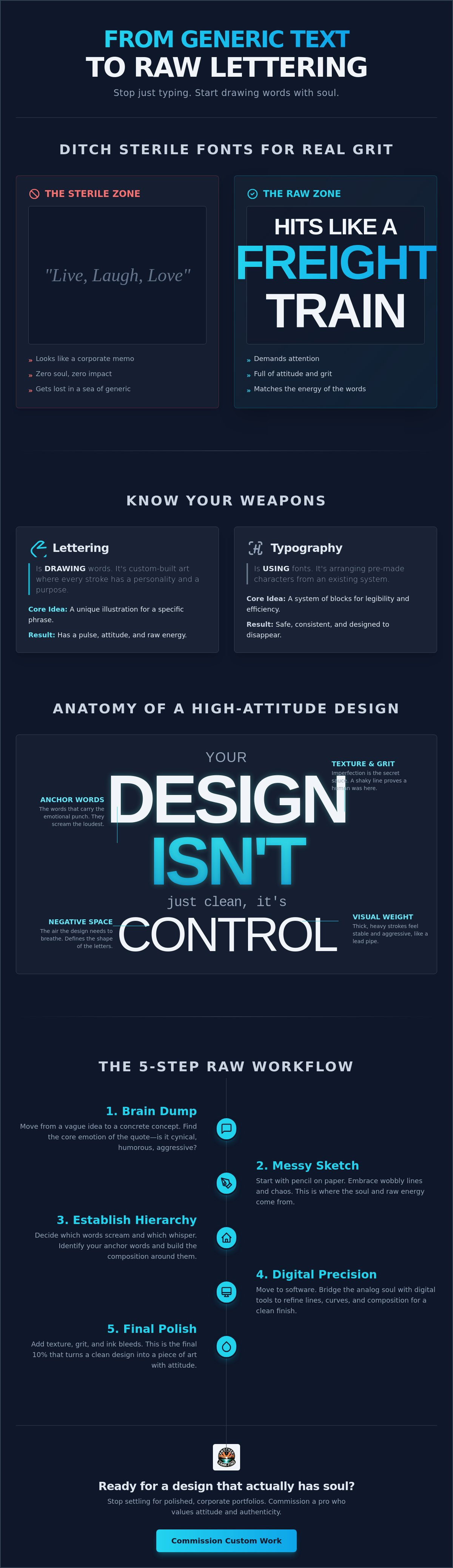
Most digital typography has the personality of a wet napkin. You've got a quote that hits like a freight train, but when you type it out, it looks like a corporate HR memo. It's sterile. It's boring. It's got zero soul. If you're tired of your message getting lost in a sea of generic fonts, it's time to start turning a quote into a lettering design that actually demands attention. You already know that a great line deserves more than just a default setting; it needs a visual identity that matches its raw energy.
We're done with designs that look too polished and plastic. You want that custom, professional look but struggle to decide which words to shout and which to whisper. This guide shows you how to transform basic text into a high-impact, raw design that hits harder than any pre-packaged font ever could. We're diving into the "why" behind layout choices and the 2026 trend of typographic maximalism. You'll learn how to match your visual style to a cynical or humorous quote, ensuring your words finally have some damn soul.
Key Takeaways
- Stop just typing your thoughts; learn why lettering is actually drawing and how to ditch sterile fonts for something with real grit.
- Master the hierarchy of noise to decide which words in your quote deserve to scream and which ones should whisper for maximum visual impact.
- Follow a raw, 5-step workflow for turning a quote into a lettering design, moving from chaotic brain dumps to polished, print-ready art.
- Bridge the gap between analog soul and digital precision by starting with messy pencil sketches before moving to software for the final finish.
- Identify when to put the pen down and commission a pro who values attitude and authenticity over a polished, corporate portfolio.
What is Quote Lettering (and Why Your Fonts Look Like Generic BS)
Lettering isn't writing. It's drawing. Most people think they're designing when they pick a font from a dropdown menu. They're wrong. That's just choosing a flavor of vanilla. When you start turning a quote into a lettering design, you're building a visual world from the ground up. Standard fonts are designed to be legible in long paragraphs. They're meant to disappear. But a great quote should slap you in the face. It needs friction. It needs weight.
Standard fonts often live in the "Uncanny Valley" of design. They try to look human but feel hollow. They're too perfect. Too symmetrical. When you're turning a quote into a lettering design, you embrace the chaos. You want the wobbly line. You want the heavy ink bleed. That's where the soul lives. It's the difference between a mass-produced plastic chair and a hand-carved stool. One is a commodity. The other is a statement.
Lettering vs. Typography: Know the Difference
Typography is a system of pre-made blocks. It's efficient. It's safe. Lettering is a custom-built house designed for one specific inhabitant: your words. It's about artfully drawing letters so they interact with each other in ways a font never could. Hand-drawn doesn't mean it's a mess. It means it has a pulse. Every stroke has a personality. Every curve has an attitude. You aren't just arranging characters; you're choreographing a performance.
The Problem with "Live, Laugh, Love" Aesthetics
We've all seen those thin, loopy scripts on wooden boards in big-box stores. They're the visual equivalent of elevator music. Generic designs kill the impact of a quote that's actually funny, cynical, or raw. If your quote has teeth, don't give it a "Live, Laugh, Love" makeover. That's a fast track to being ignored. You need something that mirrors the energy of the language itself.
At Another DAMM Find, we prioritize the raw over the refined. We want the stuff that looks like it was scratched into a desk or painted on a brick wall with a steady hand and a heavy heart. This raw lettering aesthetic is about imperfection. It's about making the visual weight match the energy of the quote. If the words are loud, the design should be deafening. It's about honesty. It's about grit. It's about making sure your words actually say something before anyone even reads them.
The Anatomy of a High-Attitude Lettering Design
Design isn't just about making things look clean. It's about control. When you're turning a quote into a lettering design, you're deciding how the reader feels before they even process the language. Hierarchy is the roadmap for the reader’s eyes. It tells them where to look first, where to linger, and what to take home. If every word is the same size, your design is a flatline. It’s dead. You need peaks and valleys. You need drama.
Visual weight is about gravity. Thick, heavy strokes feel stable and aggressive. Thin lines feel fragile or elegant. If you're designing for a cynical quote, you want weight that feels like a lead pipe. Negative space is your silent partner. What you don’t draw defines the shape of the letters. It’s the air the design needs to breathe. Without it, your work is just a cramped mess. Turning a quote into a lettering design requires a deep dive into the visual honesty of the text.
Choosing Your Anchor Words
Identify the one or two words that carry the emotional punch. These are your anchors. Maybe they’re the funniest part of the joke or the heaviest part of the truth. You don't just make them bigger. You change their weight. You give them more space. Understanding the anatomy of type helps you see how ascenders and descenders can lock together like a puzzle. This isn't about perfection; it's about composition. Hierarchy serves as the roadmap for the reader’s eyes.
Texture and Grit: Adding the Raw Factor
Texture is where the soul shows up. If the quote is aggressive, give the letters jagged, razor-sharp edges. If it’s a joke, go for rounded, bubbly forms that don't take themselves too seriously. This is the "distressed" look. It should feel like it was born in a workshop, not a sterile lab. Imperfection is the secret sauce. A little ink bleed or a shaky line proves a human was here. It’s why Rich Damm original lettering prints feel so different from anything you'll find at a mall.
Style matching is about visual honesty. You wouldn't use a delicate cursive for a quote about submarine warfare. That's a mismatch. It’s confusing. You want the "look" of the letters to scream the same message as the words. If the quote is about resilience, the letters should look like they've survived a fight. If it's about a specific subculture, use the visual cues those communities recognize. This creates a shared attitude between the art and the audience.
Hand Lettering vs. Digital Tools: Choosing Your Weapon
The debate between analog and digital is usually a waste of time. You don't need to pick a side. You need to pick a result. If you want soul, you start with the physical. If you want to actually sell a product, you finish with the digital. Turning a quote into a lettering design is a hybrid game. It's about capturing the human error of a hand-drawn stroke and preserving it in a format that doesn't fall apart when you scale it up for a hoodie. You want the grit of the street combined with the precision of a professional file.
Analog tools offer friction. There is a specific tactile feedback you get from a pencil dragging across paper that a tablet glass just can't mimic. This resistance slows you down. It makes you think about the curve. It makes you feel the weight of the ink. But once that ink is dry, it's static. That's where the software comes in. Digital tools are for the heavy lifting of production. They turn a raw sketch into vector art; this is the absolute gold standard for vinyl decals and stickers because it never loses quality, no matter how big you blast it.
Analog Tools: Pencil, Ink, and Paper
The best designs usually start as a mess on a napkin or a cheap sketchbook. You don't need expensive brush pens to start. You need a pencil for the layout and a high-contrast black ink pen for commitment. Rich Damm often starts with raw ink on paper because it captures the shaky authenticity that defines the brand. This raw start ensures the final piece doesn't look like a sterile corporate logo. You want the ink to bleed slightly. You want the imperfections that prove a human was actually in the room. It’s the difference between a soul and a simulation.
Digital Tools: Procreate, Illustrator, and Beyond
Once the sketch is done, you move to the screen. Software like Procreate is great for refining the "hand-drawn" feel without losing the grit. But for products like custom printed coffee mugs or long sleeve graphic tees, you need Adobe Illustrator. In 2026, high resolution is the bare minimum. You need clean, scalable vectors. This allows you to clean up the stray marks while keeping the jagged edges that give the design its teeth. It’s about making your art print-ready without stripping away its identity. Digital finishing ensures your raw soul looks professional on every piece of gear you drop.
From Napkin Sketch to Final Ink: The 5-Step Process
Turning a quote into a lettering design isn't a linear path. It's a hunt. You start with the Brain Dump. Write that quote in five different moods. Make it angry. Make it quiet. Make it sarcastic. Make it heavy enough to sink a ship. If you don't explore the edges of how the words can feel, you'll settle for the middle. And the middle is where boring art goes to die. This stage is about breaking your brain out of its default settings and finding the hidden energy in the text.
Next, move to Thumbnail Sketching. This is where you map out the 3D shape of the text block. Think about circles, diamonds, or "exploding" text. Don't worry about the letters yet. Focus on the silhouette and the overall vibe of the layout.
Thumbnailing: The Secret to Better Layouts
Most amateurs get married to their first idea. That's a mistake. Draw ten tiny versions before you touch a real sheet of paper. Test the boundaries. Thumbnails are low-stakes experiments for high-impact results.
Once you have a shape, hit The Rough Pencil. This is where you flesh out the letterforms and spacing. Think of this as the skeleton of your design. Build the bones before you worry about the skin. Then, move to Inking. This is commitment. Use bold lines. Add character. This is where you decide which parts of the letters are thick and which are thin. Finally, you're Digitizing. Scan that soul into a computer so it's ready for the world. This step ensures your raw, hand-drawn work can live on a screen without losing its teeth.
Refining the Details
Watch your kerning. That's the space between your individual letters. If it's too tight, it's unreadable. If it's too loose, it's a mess. Add flourishes only if they add meaning. Don't just decorate for the sake of it. If your design is aggressive, use sharp, pointed flourishes. If it's humorous, go with something more rounded. If you've put in the work to create something great, you need to protect it. Check out how to wash graphic tees to keep your final art from cracking or fading after the first wear.
You've built the structure. Now you need the finish. This 5-step process for turning a quote into a lettering design turns a random thought into a visual weapon that actually means something. It's about taking a quote and giving it a physical presence that demands respect. If you want to see how this process looks when it's done right, explore our collection of raw lettering apparel and feel the difference for yourself. Don't settle for the sterile stuff you find everywhere else.
Commissioning a Custom Design That Actually Has Soul
DIY is great for late-night experiments. It’s a disaster when you need a high-stakes gift or a visual identity that doesn't look like a template. Sometimes you need a professional who understands the difference between a "pretty font" and a visual punch to the gut. Turning a quote into a lettering design is a high-wire act of balance and grit. You want an artist who prioritizes attitude over a polished, corporate portfolio. You want the raw stuff that looks like it has a history. You want something that doesn't just sit on a shirt but actually lives there.
Perspective is everything in art. Rich Damm brings a specific, unfiltered edge to every project he touches. His background as a submarine veteran and an amputee informs the bold, resilient nature of his work. This isn't some sterile, anti-septic design studio. It's a place where the search for unique items is a passion, not just a job. We don’t do generic BS. We do high-impact, high-attitude art that honors the weight of your words. You can read more about the roots of this work in The Another DAMM Find Story.
The Value of a Veteran’s Perspective
Submarine service teaches you about pressure. The amputee experience teaches you about resilience. When those two worlds collide, you get a design style that doesn't know how to quit. Another DAMM Find isn’t your average corporate print shop. We aren't interested in mass-market approval. We’re interested in authenticity. Every stroke is intentional. Every imperfection is a badge of honor. This veteran-owned perspective ensures your custom project has a backbone that most "modern" designs are missing.
Ready to Start Your Own Project?
Ready to pull your favorite quote out of your notes app? Turning a quote into a lettering design is how you transform a fleeting thought into a permanent statement. Whether you want Rich Damm Original Lettering Prints to hang on your wall or custom Submarine Veteran Hoodies for your crew, the process starts with honesty. Give us a brief that captures the mood. Don’t just tell us the words. Tell us the energy. Is it a cynical joke? A call to arms? A tribute to the grind? The more grit you give us in the brief, the more soul we can put into the ink.
We take that energy and bake it into custom tank tops, embroidered snapback hats, and vinyl decals. This isn't just about making a product. It’s about creating a conversation-starting piece of apparel that actually means something to the person wearing it. We handle the heavy lifting of layout, weight, and texture so you don't have to. Stop settling for mass-produced trash that has the personality of a blank wall. Commission your own custom hand lettering gift here! and let’s build something that actually has some damn soul.
Stop Letting Your Words Fade Into the Background
Your message deserves more than a default setting. You've learned that lettering is about drawing with intent, creating a hierarchy that guides the eye, and embracing the beautiful chaos of raw texture. turning a quote into a lettering design is how you bridge the gap between a fleeting thought and a permanent visual statement. It’s about making the visual weight match the emotional punch of your words. If you want people to actually listen, you have to give them something they can’t look away from.
If you're ready to move past the sterile, mass-produced look, we're here to help. Rich Damm brings a unique veteran’s perspective and a raw, hand-lettered aesthetic to every project. We create original conversational pieces for amputees and veterans who value authenticity over corporate polish. Don't settle for the generic stuff that has zero personality. Get a custom lettering design that doesn’t suck and finally give your words the soul they deserve. It's time to make it loud.
Common Questions About Lettering and Design
How do I choose the right quote for a lettering design?
Pick something with teeth. Avoid the generic "Live, Laugh, Love" fluff. Look for quotes that have a strong emotional hook or a bit of cynical humor. The best quotes for turning a quote into a lettering design are short enough to be readable but heavy enough to carry visual weight. If it doesn't make you feel something raw, it isn't worth the ink.
Do I need to be good at drawing to start hand lettering?
No. You need to be good at seeing shapes. Lettering is drawing, not writing, but it's a skill you build through repetition. Start with basic geometric forms and build from there. The "raw" aesthetic actually thrives on imperfection. Those shaky lines you're worried about are actually your biggest asset when you're trying to give your work some damn soul.
What is the best way to turn my hand-drawn art into a t-shirt?
Scan it at high resolution and vectorize it. You need clean, scalable lines so the design doesn't turn into a pixelated mess when it's printed. Once you have a vector file, you can put it on anything from Amputee Awareness T-Shirts to Submarine Veteran Hoodies. Digital finishing ensures your hand-drawn grit survives the transition to fabric without losing its impact.
How much does it cost to commission a custom lettering design in 2026?
In 2026, freelance graphic designers typically charge between $25 and $150 per hour, with mid-level designers averaging $45 to $85 per hour. Project-based pricing for a logo design can range from $200 to $800+. You're paying for the attitude and the unique perspective, not just the time spent drawing. It’s an investment in a piece that actually says something.
Can I use hand lettering for my business logo?
Absolutely. It’s the best way to stand out from the sea of boring, corporate sans-serif logos. Custom lettering gives your brand an immediate sense of identity and authenticity. It tells your customers that you aren't just another faceless entity. Just make sure the style matches the energy of your business; don't use aggressive jagged letters for a bakery.
What is the difference between hand lettering and calligraphy?
Calligraphy is about the motion of writing; lettering is about the construction of drawing. Calligraphy relies on specific tools and single strokes to create letters. Lettering allows you to go back, refine, and build up the shapes. It’s more like illustration. When you're turning a quote into a lettering design, you're illustrating the message rather than just writing it down beautifully.
How long does it take to create a finished lettering piece?
It depends on the grit. A simple napkin sketch might take twenty minutes, but a fully refined, digitized design for a product like a coffee mug can take several hours or even days. The 5-step process we covered ensures you don't rush the soul out of the piece. Good art takes as long as it takes to feel right.
What are the best pens for beginners in lettering?
Start cheap. You don't need a hundred-dollar brush pen to find your style. A simple pencil is best for the layout phase. For inking, look for high-contrast black pens that scan well. Many artists prefer felt-tip pens or even a basic Sharpie for that raw, heavy look. The goal is bold lines that capture the energy of your hand-drawn work.


